
Shadow Fight Poster
A bold key-art poster exploring dramatic lighting, motion and typography for a fighting-game concept.
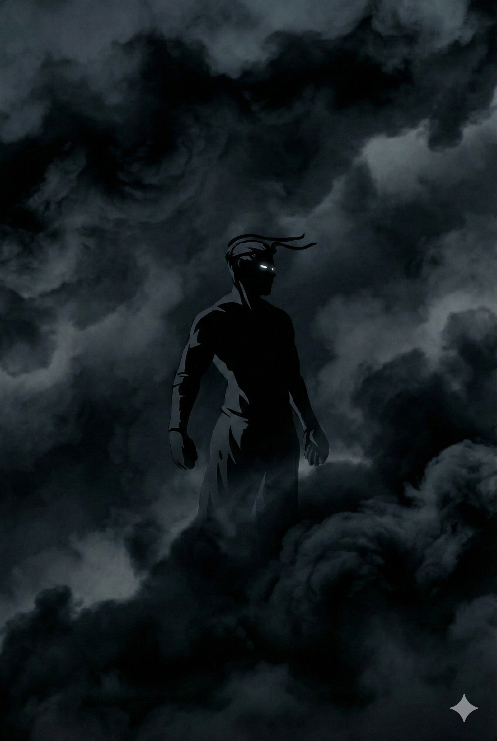
One still frame, as much energy as possible
A poster design exploring how far typography, lighting and composition can push a single still image to feel as kinetic as the fighting-game genre it represents.
No motion, no sound — just the frame
Fighting-game key art has to communicate energy and impact in a single frame — no motion, no sound, just composition and contrast doing all the work to sell the moment.
Motion lines, rim light, condensed type
A high-contrast composition built around diagonal motion lines, dramatic rim lighting on the central figure, and bold condensed typography that echoes the graphic language of fighting-game logos and title cards.
Thumbnails first, lighting last
Explored several compositional directions through quick thumbnails, then refined the chosen direction with layered lighting effects, color grading and a custom typography treatment for the title lockup.
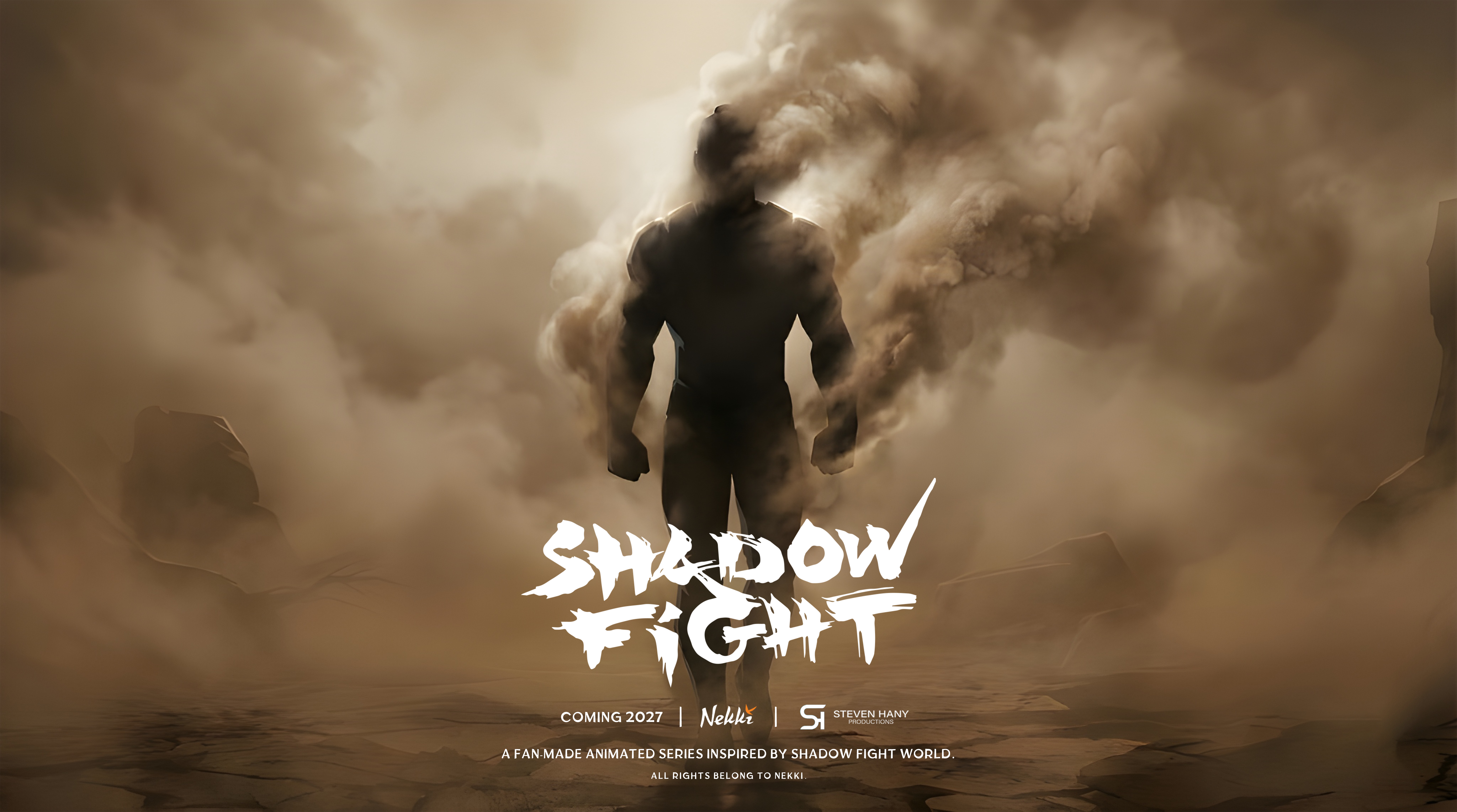
Readable at billboard size or a thumbnail
A single, polished key-art poster with a strong focal hierarchy — silhouette first, then title, then supporting details — built to hold up at both billboard scale and thumbnail size.
A self-directed piece, built to show range
A personal project built to demonstrate range in graphic design and key-art composition outside of client work.